In the early days of web design, many people proposed solutions for a type of layout that became known as the holy grail layout.
The idea was that the layout would have the following characteristics:
- it would have a header, a footer, and a middle three-column section
- the footer would stick to the bottom of the page when content was sparse
- the middle column would be flexible; the two sidebars would be fixed-width
- for SEO, the middle column would appear first in the code for the middle row, but would appear second in the browser window. So there user would see in this order in the middle area: a nav element, a content area, and then an ads area (in HTML5 terms: a nav, a main, and an aside)
- all columns would have the same height, regardless of which was biggest, without setting an explicit height for the main content, but rather letting the content determine the height
Your task in this exercise is to build that layout. Use no floats. Just flex.
Use these files as a starting point.
Above 1000px, make the nav area stay at 200px and the ad area 300px. The content area in between them needs to be flexible, growing with the browser window.
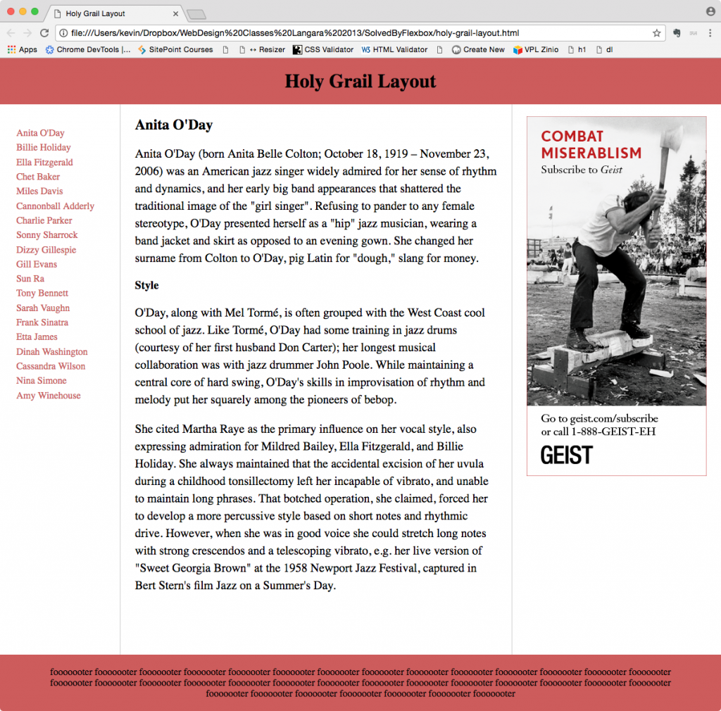
Below are bare-bones screenshots of the phone and desktop layouts. I didn’t do much styling. The emphasis here is just getting the flex-based structure to work.
In first, we see that the aside (on the right, with the ad) is taller.
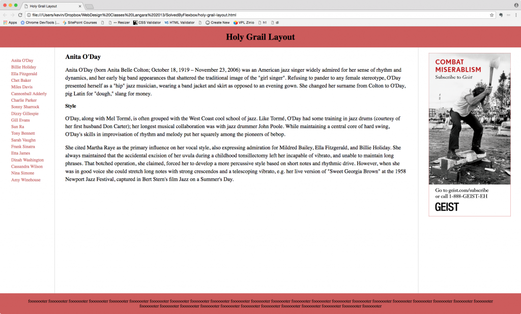
But in the next one, the main content is taller:
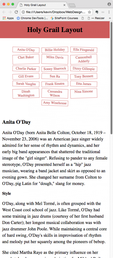
And here is the phone layout. For amusement, rotate the buttons.