The exercise will focus on the essential points of the FLEXBOX CSS module. It won’t have anything design-related—just pure css layout concepts.
To begin, make a folder, set it up as a new Atom project, then make an index.html file with a single unordered list with 15 list items, each holding one single-word link.
<ul>
  <li><a href="#">Lorem.</a></li>
  <li><a href="#">Libero.</a></li>
  <li><a href="#">Repudiandae!</a></li>
  <li><a href="#">Deserunt.</a></li>
  <li><a href="#">Tenetur.</a></li>
  <li><a href="#">Provident.</a></li>
  <li><a href="#">Ut.</a></li>
  <li><a href="#">Veritatis.</a></li>
  <li><a href="#">Ratione.</a></li>
  <li><a href="#">Ratione?</a></li>
  <li><a href="#">Dolores?</a></li>
  <li><a href="#">Voluptatum!</a></li>
  <li><a href="#">Facilis.</a></li>
  <li><a href="#">Eius?</a></li>
  <li><a href="#">Est?</a></li>
</ul>
Now remove the list’s dots, and zero out its margin and padding.
Give the LIs a border, and set the LINKS to display: block with generous padding.
    ul {
      list-style-type: none;
      margin: 0;
      padding: 0;
    }
    li {
      border:1px solid black;
      box-sizing: border-box;
    }
    a {
      text-decoration: none;
      display: block;
      padding: 1rem;
    }
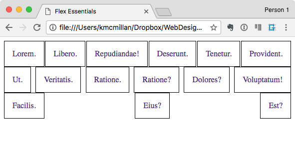
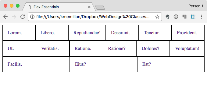
Test your page in a browser. It should look like a bunch of boxes taking the full width of the page, in the default UL layout of a single column.
Now, set the UL to display:flex. Your list should now look something like this:
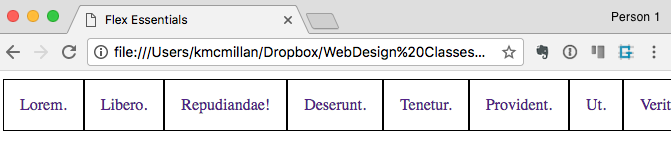
We see, then, that the LIs are now arranged in a single row. Each box is a different width. In other words, its content size (single word + padding) is determining the box size.
Flex-Flow
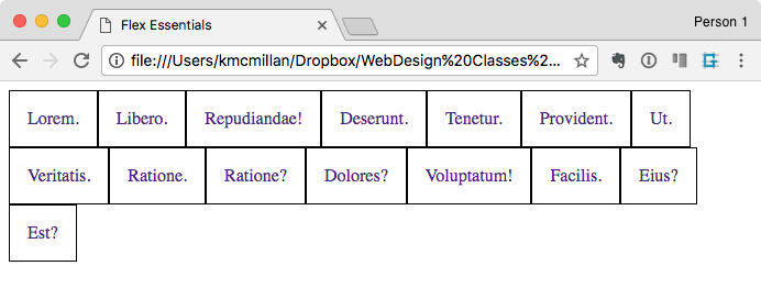
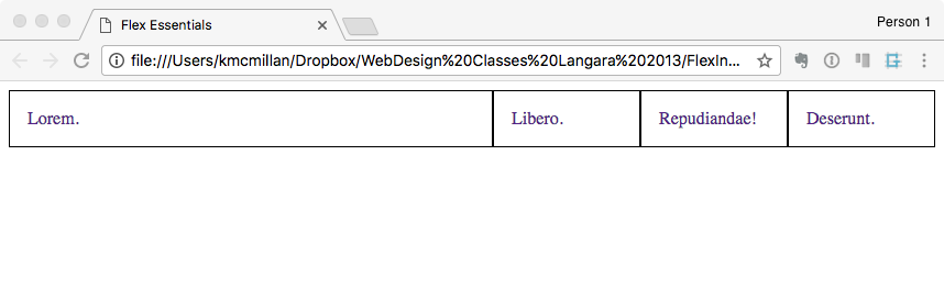
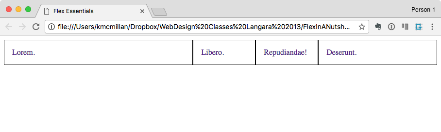
In addition, notice that the LIs are running off the page. This is because the default FLEX-FLOW value on the UL is ROW NOWRAP. ( Flex-flow is a shorthand property combining Flex-Direction and Flex-Wrap ).
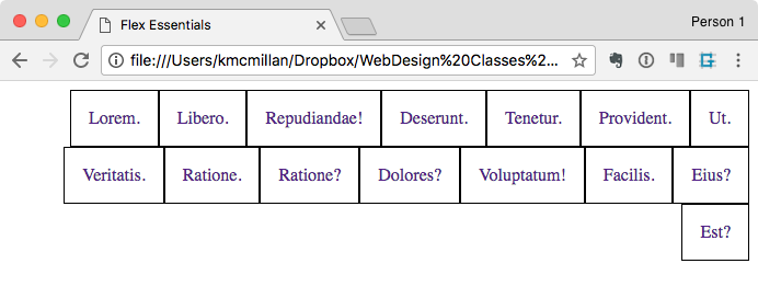
Let’s change that. In your UL style add FLEX-FLOW: ROW WRAP. Your page should now look like this:
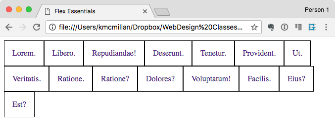
What we observe here is that the list items are filling as much of each row as will fit, then wrapping. In a sense, they’re behaving similarly to inline-block elements.
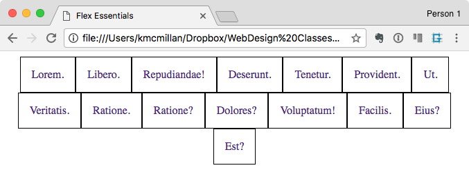
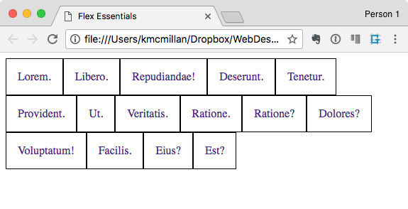
One way FLEX gets its name, however, is from how easily we can adjust the distribution of the items. For example, if we add justify-content: center to our UL style, the elements will line up in the center of each row, and the remaining space will appear at the sides:
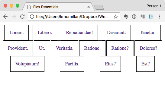
Additional values for JUSTIFY-CONTENT include
- Space-Around: additional space is distributed on each side of each flex-child (first screenshot below)
- Space-Between: additional space is distributed on each side of each flex-child, except not on the beginning or end of the row (second screenshot below)
- Flex-Start: the items line up at the front of the row, and additional space is put at the end of the row (third screenshot below)
- Flex-End: the items line up at the front of the row, and additional space is put at the end of the row (fourth screenshot below)
Flex-Grow, Flex-Shrink, Flex-Basis: FLEX
So far, all the Flex properties have been applied to the Flex Parent.
Three very useful properties that get applied to flex-children are Flex-Grow, Flex-Shrink, and Flex-Basis. All three are quite typically applied as the Flex shorthand property. I think that its actually easier to understand each if you use the shorthand method.
All three properties concern how the browser will assign space in each flex row or column.
With just FLEX-FLOW:Row Wrap set on our UL, our list lines up like this:
Now, add flex:1 0 100px; to the LI style. Resize the browser window (bigger and smaller).
In the FLEX shorthand property, order matters. The first is the FLEX-GROW value, then FLEX-SHRINK, then FLEX-BASIS.
FLEX-BASIS represents the starting size of the element. So in the above code, each LI’s initial width is 100px. The browser will place as many of the 100px LIs in the ROW (in this case). Then it will calculate how much additional space is left. That additional space will be distributed by referring to the FLEX-GROW property. Since all our LIs have a FLEX-GROW value of 1, they will all get an equal share of the remaining space.
To understand how Flex-Grow really works, let’s comment out all but four of the list items. Add the following style:
    li:first-of-type{
      flex: 10 0 100px;
    }
We see here that the FLEX-GROW property on the first LIST ITEM is set to 10. Test the page in a browser (resizing big and small).
This whole shorthand, then, means that the first item will get 10 times as much of the remaining space as the other items.
Now add the following style:
    li:nth-of-type(4) {
      flex: 5 0 100px;
    }
This means that the fourth list item will get 5 times as much of the leftover space as the “ordinary” LIs (which have flex-grow values of 1), but only half as much of the additional space as the first LI (which has a flex grow value of 10). In the screenshot below, we see this reflected.
So, in a nutshell, our FLEX shorthand sets the “starting” size of the element, and the FLEX-GROW propertiy determines how much “leftover space” in the parent is distributed to each of the flex children.
The FLEX-SHRINK property will determine how items are allowed to shrink. It’s not as commonly used as FLEX-GROW. That is why I’ve set the FLEX-SHRINK to zero: a value of zero means the element won’t shrink (and a value of zero for FLEX-GROW means it won’t grow).
Hopefully, this simple example gives you a sense of what we can do with FLEX. There are a lot of additional things we can manipulate with flex, but you can build a lot of layouts with what we’ve covered here.
In later exercises, we’ll examine those properties.