The Task
Download the files you need for this exercise.
Double-click the zip archive if it doesn’t decompress automatically. You will be left with a folder called GibsonHTMLExercise.
Inside that folder is an index.html file, a folder of images, and a folder of additional pages (called, naturally enough, pages).
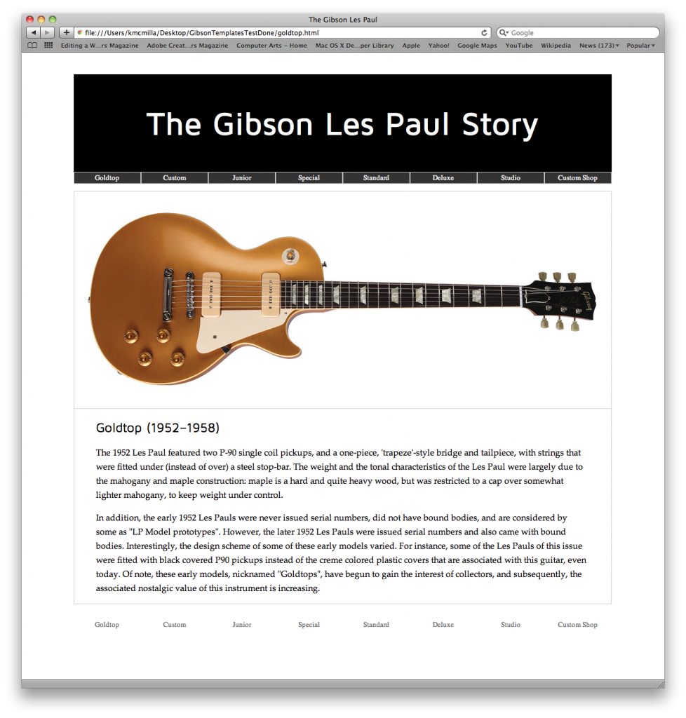
Open the file screenshot.png. Your task is to make a web site that looks like that.
All the HTML files have most of the HTML content already. You will need to add the image and the two menus.
A New Tag: Header
You will also notice a new tag: header. This was added to the latest iteration of the language (html5). This tag allows us to group elements together. Ultimately, the header tag allows us to construct a banner-type area. In this case we will put the h1 and the menu between the opening and closing header tags.
You code the menus. Mark up both (top and bottom) as ULs. They are the same html, but are styled differently. See if you can style them in the most efficient manner (ie with the least amount of CSS).
You can find the actual link text by opening up the screenshot image in the files you just downloaded.
You’ll notice that the menus have more links than we have pages. For menu items that don’t have corresponding pages, just use testing links (the # symbol).
After the closing header but before the h2, add the image whose name corresponds to each html file. If they don’t match, choose an image at random: this is just an exercise, after all.
Challenges
In doing this exercise, certain challenges present themselves:
Paths to Images
If you are placing the lespaulCustom image in the index page, your src attribute will be images/lespaulCustom.jpg
However, if you are placing the same file in one of the html pages in the pages folder, your src attribute will be ../images/lespaulCustom.jpg.
The ../ means go up one level in the folder hierarchy.
Paths to the Stylesheet
Similarly, with the way the site is currently set up, the path to the stylesheet will change depending on which html page you are editing.
Specifically, the path the stylesheet (assuming you save it in the top level of the site) will be styles.css if you’re referring to it from the index page, but ../styles.css from pages within the pages folder.
Paths to the HTML Pages
In this instance, depending on which page they’re in, the paths in the menu links will change. Links to pages inside the pages folder will depend on which page you’re referring to them from.
One of your tasks here is to figure this out and make the menu work perfectly whether you’re in the index.html page or one of those inside the pages folder.
The Horizontal Menu
I asked you to use ULs for the menus. Usually, the LIs show up on successive lines. However, if you give them a width value and then float them left or right, they will line up horizontally.
To make things easy (at first), give the LIs a percentage width. We have eight menu items, so work out the math.
Styling the Whole Thing
The Main Column
Obviously, this is a simple single-column layout.
Wrap everything inside the <body> of the document inside a DIV with a class attribute of “wrapper”.
In your stylesheet, add the following:
.wrapper {
  margin: 60px auto;
  max-width: 990px;
}
Here we’re using CSS shorthand: if we specify one value, top, right, bottom, & left will all have the same value. If we specify four values, each will be assigned in that order (clockwise). If we specify two values, the first refers to top & bottom, while the second refers to right & left.
When we use a value of auto for left and right margin, it will center the element it is applied to.
I gave this DIV a max-width of 990px to match the width of the images.
By setting a max-width rather than a width, we keep this layout responsive: the image and column both will shrink as the browser resizes. However, the DIV will never go beyond a width of 990px. ( To make a more readable line, we probably want an even narrower article. We could, however, add margin or padding to the paragraphs, etc).
By wrapping everything inside the document inside a .wrapper DIV, we can style it as a single element, and take care of the main structural element of the site with only a few lines of CSS.
Test one of your html pages in the browser. Voila: instant column.
Now try to style the rest of the elements as close to the way they are in the screenshot. Obviously, the major challenge here is the menu.
Don’t worry if everything about your layout isn’t perfect. This is a learning exercise. Have fun.
Some Hints
To make the menu not “drop out” of the header element, review this post about the clearfix hack.
If you apply borders to your menu’s LIs, you’ll break the layout (because they’re taking up 100% of their containing element. To create the same visual effect without mucking up your layout, put the border on your menus’ a element.
Here you’ll have to do one additional thing, though. To make the links take up the entire width of their containing LIs (rather than just the length of their text, as is the default behaviour for links), add display: block to their style declaration.
Another option is to change the default way the browser calculates browser width:
li {box-sizing: border-box;}
Doing this will make the browser calculate the width of the box from the border in. In the traditional box model, border and padding widths are added to the element width. This changes that to a simpler way of calculating the computed value. It’s supported, also, by every modern browser (even the not-so-modern IE8).
Guitar images © Gibson. Used with permission.
