The Theory
The CSS float property is used to create layouts where content would flow around elements (typically pictures).
In years past, in fact, entire site layouts would be done with floats. Fortunately, we now have dedicated layout modes like display:grid and display:flex, so the use of floats as a full layout tool has greatly decreased.
But it’s still useful to know because there are a couple things that float can do that cannot be done any other way.
The float property can have three values: right, left, or none.
An element with a float property applied will go as far to the left or the right as it can. Content that comes later in the html will come up beside it.
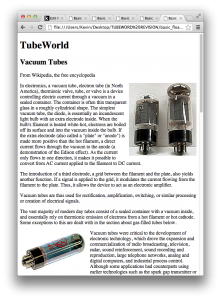
The most obvious use of the float property is to have text wrap around images.
The Practice
To demonstrate, please download these files. When the files are unzipped, you will be left with a folder called basic_floats.
In your web text editor, open up the index.html file. You will see that this is a very basic file: a few headers, a bunch of paragraphs, and a number of images inserted into a few of those paragraphs.
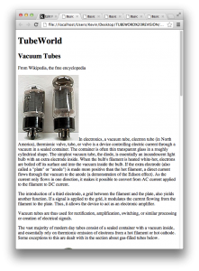
Test the file in a browser. It should look like this:
Obviously, the alignment of the text and images leaves a lot to be desired. Let’s fix that.
In the <head> of the document, you’ll notice that I’ve already “wired in” the link to the stylesheet. Open up the styles.css file and add the following bit of CSS
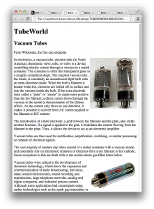
img { float: right; }Save the stylesheet. Test the html page. It should now look like this:
This is an improvement. However, the problem with what we’ve done is that every image in the site will be floated to the right. When we define a style for img, we are styling all images.
How do we style different images differently?
The Solution: Class Styles
When we make styles for h1, h2, h3, ul, li, img, body, etc, we are styling pre-existing HTML elements.
However, if we want to style only some of these elements, we can use classes.
In the css, the classname is preceded with a period. In the HTML, it is added to tags as an attribute.
Here is some sample code, taken from our document. As you can guess, it puts an image into the page:
<img src= "images/6L6.jpg" alt= "6L6">;The tag is <img>. Right now there are two attributes: src and alt.
Attributes are, in other words, just additional information about a tag. They most commonly appear in the form attribute= “value” (such as width= “220”).
Go back to your stylesheet. Make the following two styles:
.floatright { float: right; } .floatleft { float:left; }Remember: we put a dot in front of class names in the CSS.
Save the stylesheet. If we test the html page, we won’t notice any difference. This is because there is not yet any reference to either of these newly created styles in the html.
To fix that, add class= “floatright” to one of the img tags. For example:
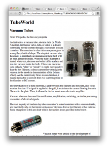
<img src= "images/6L6.jpg" alt= "6L6" class= "floatright">Save and test this html page. It should now look like this:
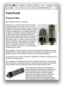
Add class= “floatleft” as an attribute to another image. The page should now look this:
Add the floatright or floatleft class as attributes to the other images in the page.
Of course, the text that’s wrapping around each image is practically touching it. To improve that, add some margin to each of your class styles:
.floatright { float: right; margin-left: 8px; } .floatleft { float:left; margin-right: 8px; }Test the html page. You should now see a nicer wrapping of text around image.
Floats, however, aren’t just for images. We can use them to make columns or to achieve other layouts.
