One billion Internet years ago (2007 or 2008, to be precise), the innovative UK company Clearleft released a usability testing tool for OSX. The website for the product, SilverbackApp.com turned heads everywhere, owing to its then-really-novel use of the parallax animation technique.
The effect is still in use on the current version of the site. In this, exercise, however, we will reverse-engineer the basic idea of the earlier version (as I made this exercise some time ago, and the technique doesn’t differ between the pages).
This original effect was created with background images on multiple elements, as the CSS3 ability to put multiple background images on a single element did not yet exist. However, in this exercise, we’ll just use the modern approach.
First of all, please download the files we need.
Then visit this earlier version of the site (one of the 466 billion pages preserved in the amazing wayback machine). Overlaid at the top of the page is a panel containing info about the page. Close this info box by clicking the red X in the top right corner.
The page should now look like this:
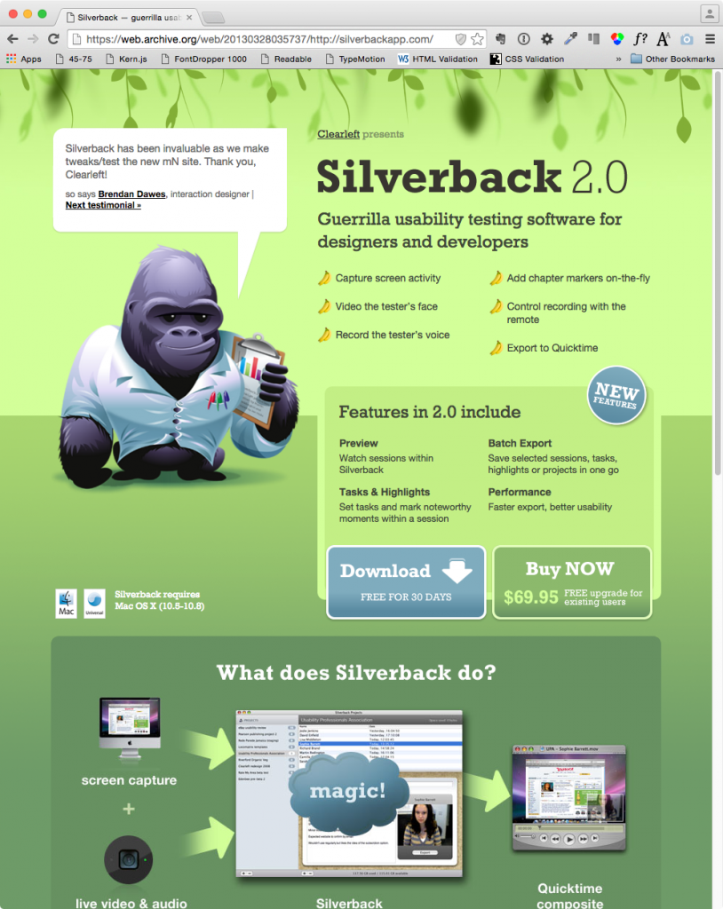
Resize the browser window while keeping an eye on the vines at the top of the page. Notice how they appear to move at different rates?
Basic Syntax
To set a background color on an element (such as on the body, as here) is easy:
body {
   background-color: #6e9b68;
}
To use a background image on an element, use the url() function:
body {
   background-image: url("images/some-image.jpg")
}
To make a CSS background be a gradient, you still use the background-image property, but the url function is switched to a linear-gradient or radial-gradient function. Colors are passed to the function in a comma-separated list:
body {
   background-image: linear-gradient(#6e9b68, #3e9b18, #6e9b68);
}
To use multiple images, or an image and a gradient, etc, just separate the individual items with commas:
body {
   background-image:  url("images/bgimage.png"),
                     linear-gradient(#6e9b68, #3e9b18, #6e9b68);
}
Browsers that support multiple backgrounds images will take up to four of them. The first specified sits on the top of the stack. The last specified sits on the bottom. So in the example directly above, we’ll have a gradient background color behind an image called bgimage.png.
Basic Parallax
Close the site, and drag the downloaded files onto the icon of your chosen editor ( Emily Carr: Atom / Langara: SublimeText ).
The HTML file has no actual content in the page—just a link to a stylesheet and a single javascript. As noted, we’re only concerning ourselves with the background treatments here.
Open the stylesheet in your editor. I’ve included two different syntax approaches.
The first, commented out, is the longhand syntax ( values are random here — the ones I actually used are in the shorthand section) .
Coding this way, we make separate declarations for background-color, background-image, background-repeat, and background-position. Examine this code. As noted, using multiple values for each involves just separating the values with commas. Use white space and new lines to make your code more easily read.
body {

	height: 100%;
	background-color: #6e9b68;

	background-image:
					 url(images/vines-mid.png),
					 url(images/vines-front.png),
					 url(images/gorilla-cropped.png),
					 url(images/body.gif);

	background-repeat:  repeat-x,
						repeat-x,
						repeat-x,
						no-repeat;

	background-position:  0 0;
						  50% 0,
						 -25% 0,
						 105% 105%;

}
The key to the effect is the background position property. By setting some in differing percentages of the browser width and height, we can have them appear to move at different speeds (just like in old-style animation). All in all, a pretty cool effect for minimal effort.
This longhand syntax is easier to understand, but now look at the shorthand syntax. It’s definitely far more concise.
.no-multbgs body {
	background-color: green;
	background-image: url(images/vines-mid.png);
}

.multiplebgs body {

    height: 100%;

    background:
		url(images/vines-front.png) -50% 0 repeat-x,
		url(images/gorilla-animated.png) bottom center no-repeat,
		url(images/vines-mid.png) -25% 0 repeat-x,

		linear-gradient(#d3ff99, #366648);

		}
Try changing values in my code. Change the gradient color. Add another color to the gradient. Figure out how to change the direction of the gradient. The Mozilla Developer Network has a good article with the info you need for that task.
What’s With The Added Classes?
In the code above, you no doubt noticed the added .no-multiplebgs and multiplebgs classes.
To understand what’s going on here, open the index page in Google Chrome and then control-click or right-click in the Document and choose Inspect Element.
This will open the Chrome Inspector. Make sure that the Elements pane is the open one.
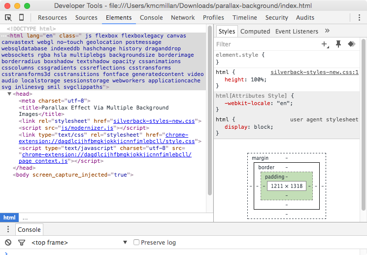
Notice all the additional classes on the HTML element? These are inserted into the document at page load by a famous javascript called modernizr.js.
What modernizr does is test browsers for their support of various features. If a browser supports a particular feature, the script adds a class to the root (html) element in the document. If it doesn’t support a particular feature, the script will add a ‘no-feature-name’ class to that element.
So we can, in other words, direct styles to older browsers that don’t support our desired feature.
If we go to the caniuse.com website and search for multiple backgrounds, we see the following:
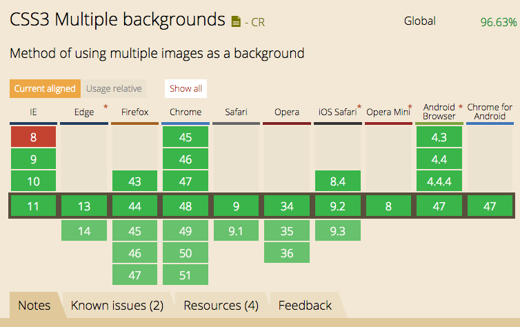
So if we’re supporting IE8, we can make sure that our site’s usability doesn’t suffer in that site.
We’ll discuss modernizr, including ways to narrow down what it’s testing, in a future class or exercise, but for more information, the wikipedia page on it is quite succinct. And, of course, you can poke around the modernizr site itself.
Another Approach to Feature Detection
Of course, another approach to feature detection is to just leverage the cascade (it’s the c in css, after all). To use a simple example: if we use rgba but have to support browsers (like IE8 again) that don’t support rgba, we can code like this:
background-color: #000;

background-color: rgba(0,0,0, .7);
Here, if the browser doesn’t understand the second value, it will fall back to the first.
The argument for going the modernizr route above, though, is that it is more explicit, and therefore less easy to inadvertently bork when editing your CSS. This is especially the case when using shorthand notation, especially: because it sets a number of defaults, it can be somewhat slippery to work with when you’re just learning CSS.
References
- CSS Tricks: Background Shorthand
- CSS Tricks: Gradient Syntax ( in authoritative detail, as usual )
- Mozilla Dev Network: Using CSS Gradients