This exercise will demonstrate ways to utilize advanced CSS selectors.
Some reasons why learning advanced selectors will benefit you.
About the Exercise
First, please download this zip archive of the files you need for the exercise.
This includes screenshots showing most of what you need to do. The screenshots were taken on a retina Mac, so they’re big, but that means that you can zoom in to see any level of detail you need.
In this exercise, you may NOT add anything to the HTML.
Instead, you must make all of your styling via pure CSS. This means, then, that you cannot add or remove classes or IDs in the document.
A Loom video describing the task.
Resources
One of your guides in this exercise will be this web page: despite the silly title of the document, it is an eye-opening resource to advanced selectors.
What You Will Do
Using the information provided by the above articles and the screenshot file, please make changes to the page that are described below.
Put all your additions in the file called mystyles.css.
I repeat: do not edit styles.css.
As an aside, an excellent and detailed explanation of advanced selectors is found in the LinkedIn Learning course The Power of Selectors. If you have access to LinkedIn Learning, this course is worth watching.
Preexisting Links in the Document
The link to the Google fonts you will use for the headings (Alegreya Sans SC and Oswald) is already in the HTML.
There is also a link to Font Awesome in the document already, for the menu icons task.
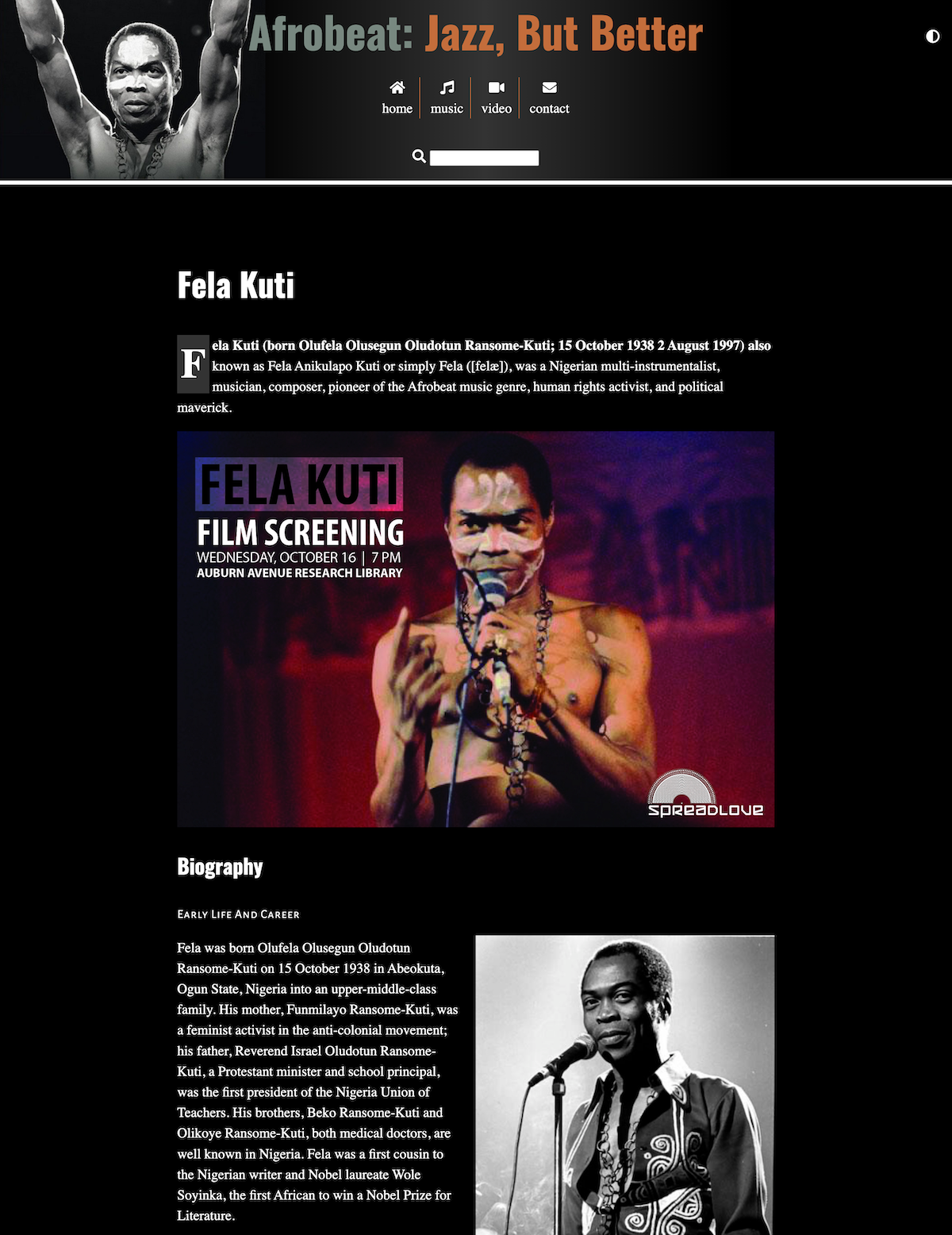
TASK ONE: HEADERS
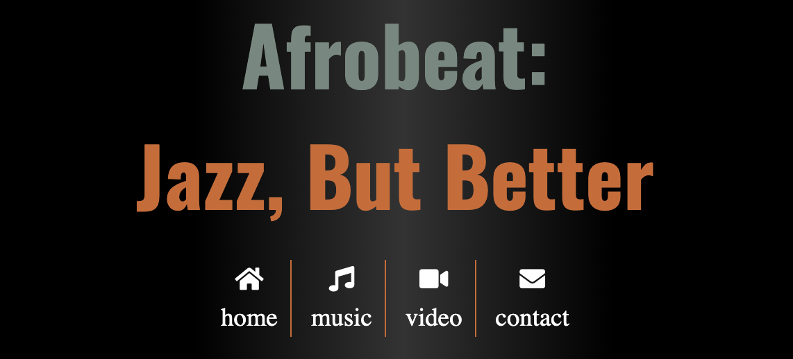
Make the h1 and h2 elements Oswald (Google font), with an appropriate fallback font stack. Do this with a single style.
Make h1 elements in the header be 3.157rem. Make h1 elements in ARTICLES be 2.369rem.
In the h1 that’s in the header, make the first word ( “Afrobeat:” ) this color: #c46d3b. Make the next three words this color: #788880. Make sure that the H1 in the ARTICLE remains black.
Note from 2018: if you’re wondering why there are two H1 elements in the document, this represents an alternative approach to HTML semantics, in which ARTICLES receive a new document outline. A validator will flag this with a warning, however. For that reason, it’s no longer viewed as a best practice. When this exercise was originally made, it was a common practice.
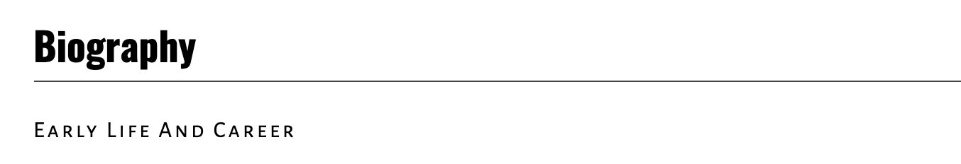
Make the H2 elements have a border bottom, like in the screenshot below.
Make every h3 use the Google font Alegreya Sans SC. Space its letters out further, as in the screenshot, using the letter-spacing property.
TASK TWO: MENU
Put a small border element between all of the list items in the header (using one of the colors you used in the header), but make sure that there is no border element before the first one and after the last one (ie at the beginning and end of the NAV).
Do this with a single CSS selector.
Remember: no changes to the HTML.
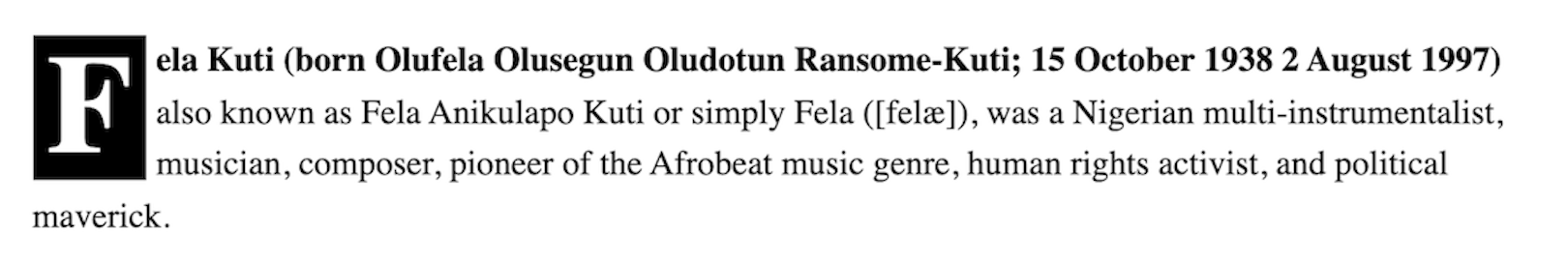
TASK THREE: FIRST PARAGRAPH STYLINGS
Make the first line of the first paragraph in the document be bold.
For an extra challenge, figure out how to select and style the “drop cap” first letter of this first paragraph.
TASK FOUR: “SECTION INTRO” PARAGRAPHS
Make the first paragraph directly following an H2 (but not an h3) be italicized and 1.777rem font-size and a line-height of 1.25:
TASK FIVE: CLEAN UP SOME UGLY TEXT WRAPPING
One problem with floated images is that they can create ugly text wrapping, as in the following example:

Fix that problem by making any images that come directly after an H3 be center-aligned with no text flowing up beside them — unless there is room for the flowing up text to have a reasonable line-length.
Again, remember that you aren’t allowed to modify the HTML.
TASK SIX: FOOTER LINK STYLING
In the footer, there is a list of “Other Important Figures in Afrobeat”. Look at the HTML and figure out how to style each “category” of link using the following colors:
- companies: lemonchiffon
- originators: deepskyblue
- contemporary artists: firebrick
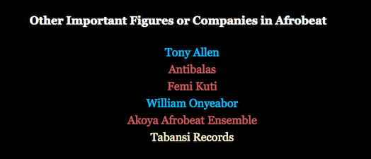
Figure out how to do this in the most extensible way, so that if we add a contemporary artist, for example, the required styling will be automatically applied. This means that styling by order (ie nth-of-type) is not the best approach here.
Make sure that the css you write does not risk links elsewhere in the page changing color (if there were any there). In other words, make the selectors both general enough to accommodate new links, but not so general that they select unintended elements in other parts of the page or site.
TASK SEVEN: A FEW MORE TWEAKS FOR SMALL VIEWPORTS
For viewports under 1000px, remove the background image on the header—but keep the linear gradient.
Finally, find a way to prevent text from coming up beside the smaller images at smaller breakpoints. These images, incidentally, are all album covers: there might be something in the ALT attributes for album covers that would work as a styling hook.
TASK EIGHT: ICON FONTS
The downloaded HTML file has Font Awesome already included as a link in the head.
The icon for the search field is already included in the site. Study the code in the styles.css file and figure out how to apply it to the links in the header menu.
Note: pseudo-elements are your friend here.
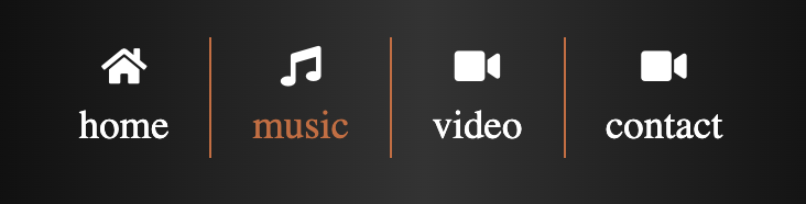
Icon Hover States
Now create a style that changes the link menu links’ color to #c46d3b; whenever the user hovers over the icon or the associated link text.
Make it so that only the link text changes color, not the icon. In the screenshot below, the music link text is changing color: in the screenshot, the cursor isn’t shown but it’s hovering over the music icon.
Test that the text changes color when the icon is hovered over.
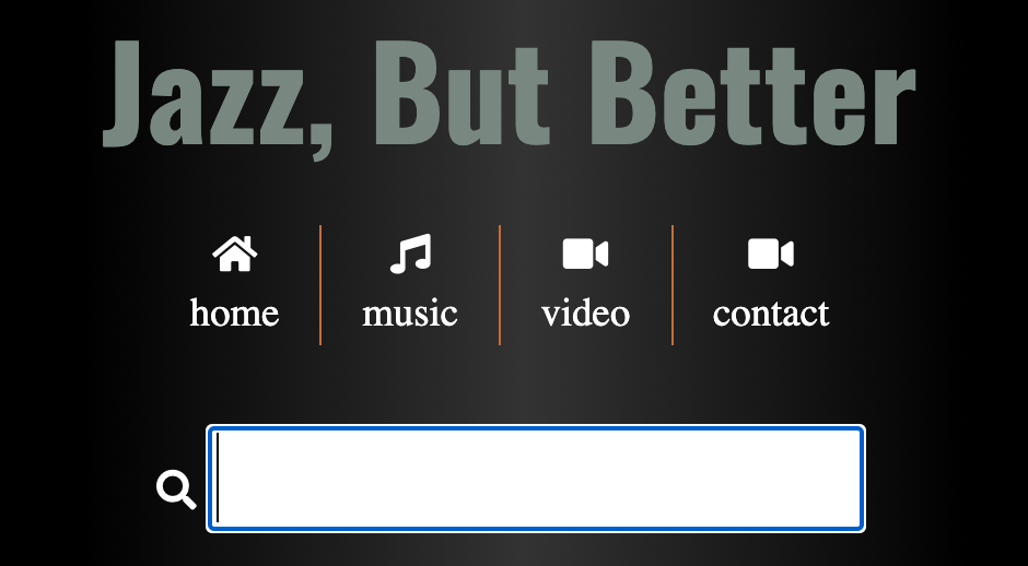
Task Nine: Expanded Search Field
When the user clicks in the Search field, make the field bigger.
Task Ten: Cool List Treatment
For this task, consult this web page. It contains some selectors the first resource I gave you does not cover.
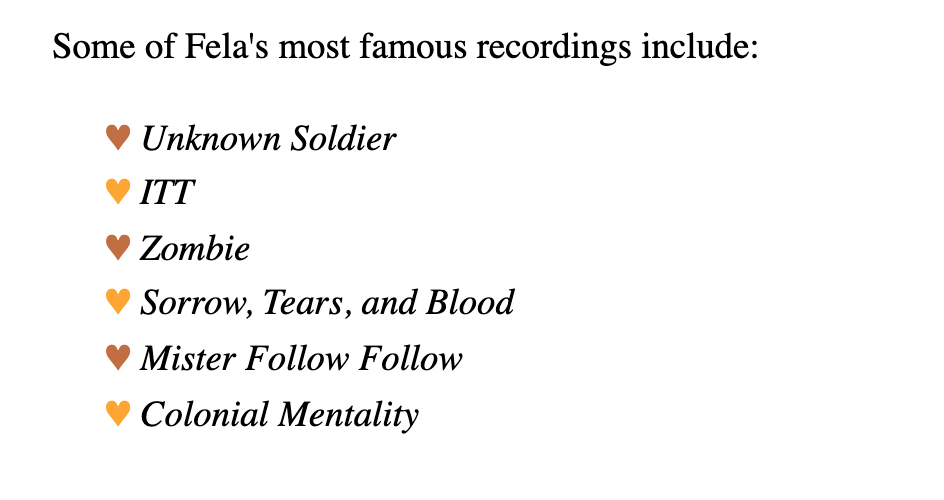
The content below is a basic Unordered List (a UL, in other words).
Use CSS concepts from the above web page to change how this list’s markers look. Specifically, rather than a dot or a square, change the item markers to a heart.
Then make the hearts alternate their colors (to aid design unity, use colors from other elements in the site).
This will involve using HTML entities (symbols), pseudo elements, and other advanced selectors.
A great resource for HTML entities is the toptal website.
Big Hint: the Font Awesome code included in styles.css uses a very similar approach: using the ::before pseudo-element to inject content (in that case, an icon font). More detail on pseudo-elements.
Note also that the song titles are italicized, but the hearts themselves are not (ie they are not tilted, so choose your selectors carefully).
Task Eleven: H1 Tweak
At small sizes (under 600px screen width), make the first word of the h1 in the header take its own line and be centered:
Task Twelve: Dark Mode
(Added 2023)
For this final task, you will give the user the ability to set a dark mode for the page. To do that, examine the markup for the .dark-mode form in the header, then:
- Use CSS Positioning to place the dark-mode form in the top right of the screen. Place it so it looks aligned.
- Use the visually-hidden class from the a11y project to hide the text for the form input label
- Inject the icon seen in the screenshot using the same technique you used for the menu icons
- Style the icon as it appears in the page
- Set the icon to display the pointer on hover
- Set the icon color, on hover, to match the word “Afrobeat” in the h1
- When the icon is clicked, get the background of the page to go black, the text to go white, and the drop shadow background to go dark grey
Here is a Loom video describing this “subtask”.
Hints:
investigate the following pseudo-classes:
- :checked
- :has [ See https://css-tricks.com/the-css-has-selector/ for a description of this revolutionary new “parent” or ancestor selector ]
Please note that as of Jan 2023, Firefox does not yet support the :has pseudo-class without a configuration change. Full support will arrive in Firefox in the near future.
In the meanwhile, test this feature with Chrome or Safari.